
Client
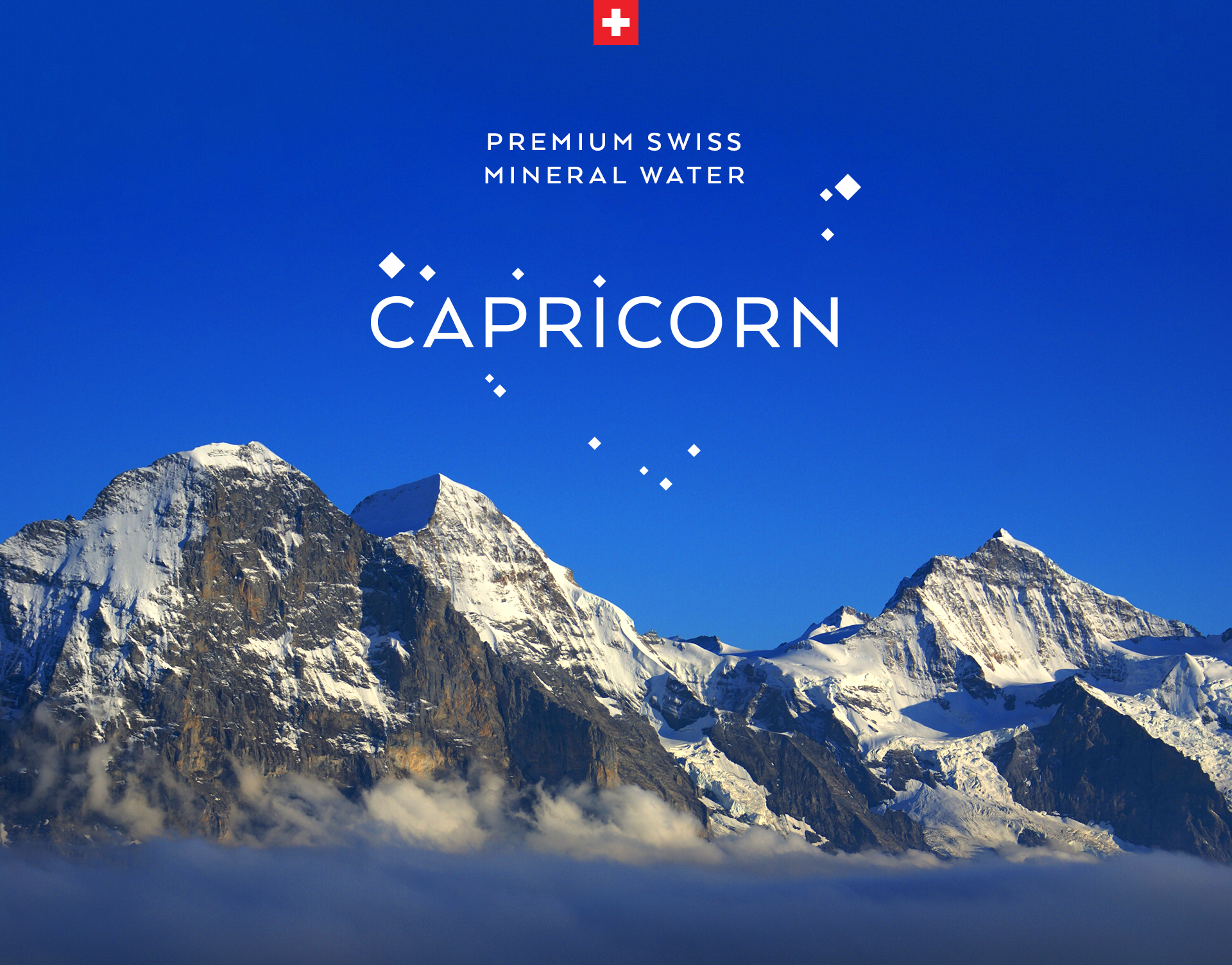
Capricorn
Services
Visual Identity
Packaging design
Capricorn is a Swiss mineral water coming from the Capricorn spring in the Alps. The client came to us with a problem: they needed to create a premium brand but at the same time they couldn’t change the name since under the Swiss law, a bottled water must use the name of the spring it comes from.
The answer: we designed a visual identity and packaging inspired by the Capricorn constellation and the mountain peaks of the region. It all comes together in elegant packaging with silver and blue backgrounds for sparkling and still water.


